
GOAL
The Gatsby® brand is conservative priced equine tack brand. Our team was tasked at creating a new brand identity for Gatsby®. My design was chosen for the new identity and would be used mostly on equine tack supplies as well as print collateral and marketing materials. We wanted the design to be fresh and inspiring and also enable it to translate well on product materials.
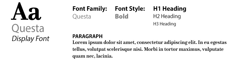
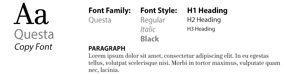
Typography
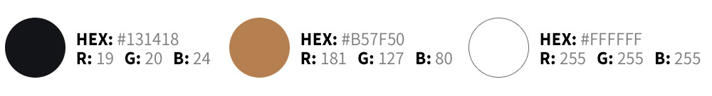
Color Palette
PROCESS
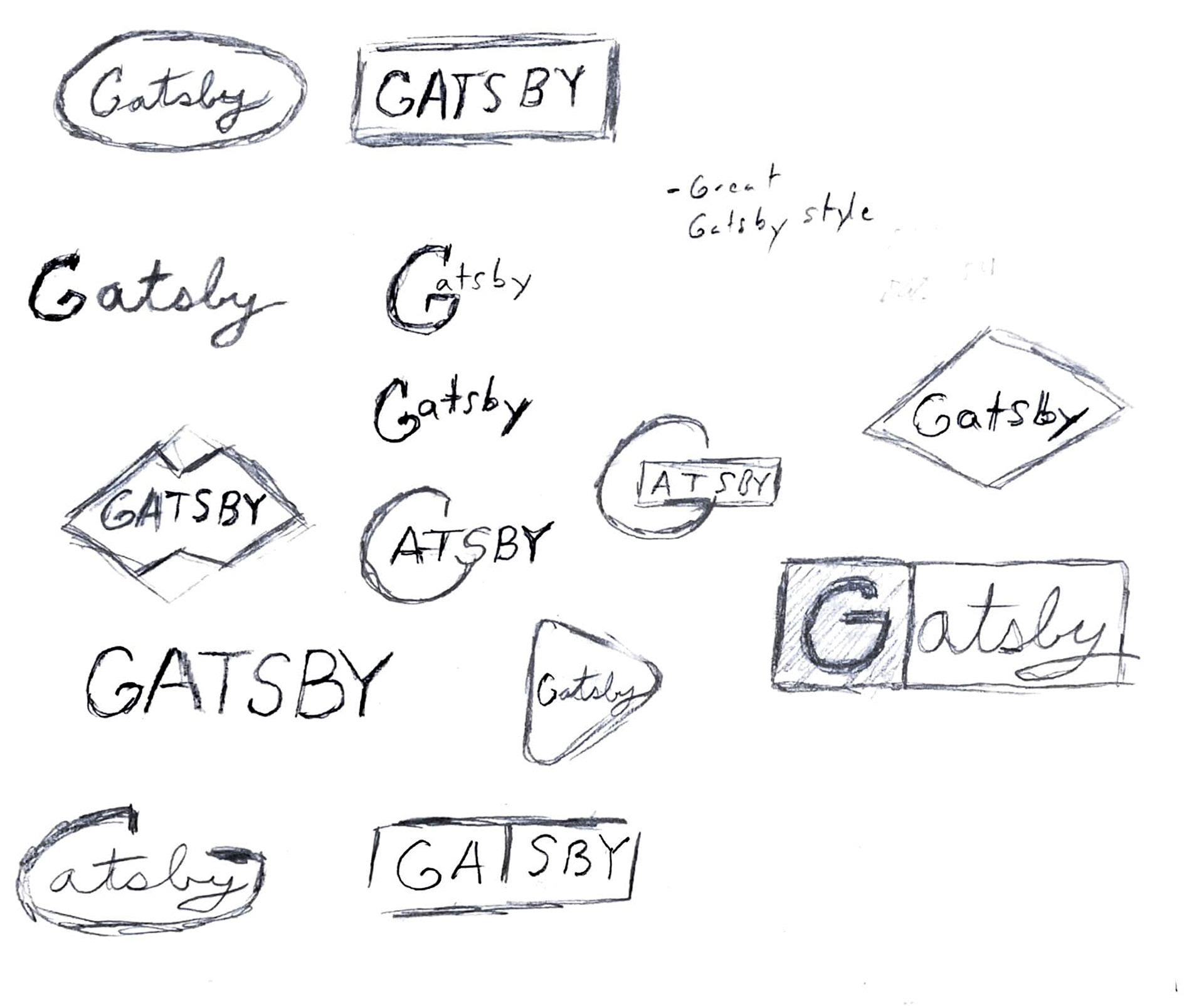
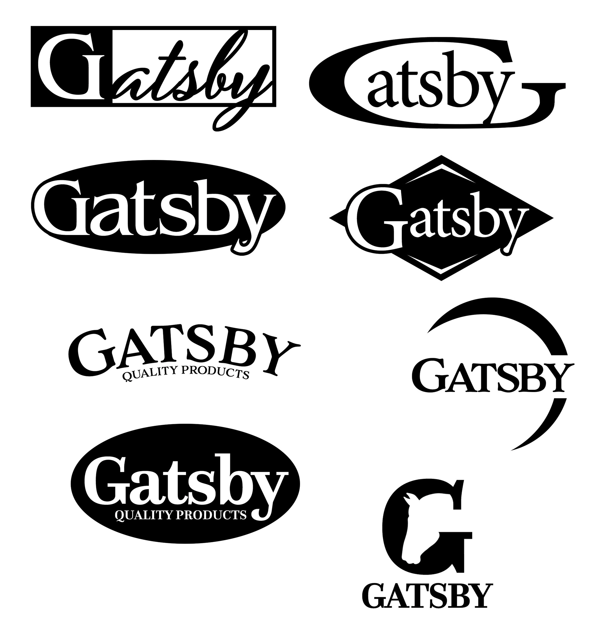
Concepting came first for the brand. As a team we gathered our thoughts on the subject then translated them in our own unique ways. We all came up with sketches then refined them down to our 3 favorites. Our team had a chance to critique one another's designs and give recommendations and positive thoughts. Converting them into vectors, helped us gain a glimpse into what could potentially be the final output. Many fonts were used in combination with the main element. Logos were also used in both vertical and horizontal formats to help successfully translate our designs. After completion, logo vectors were submitted to our company leadership team.
Mock ups
RESULT
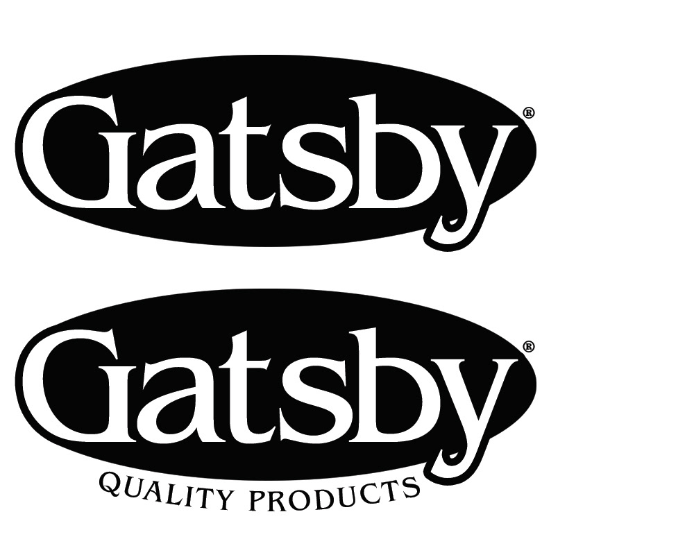
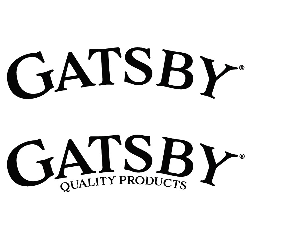
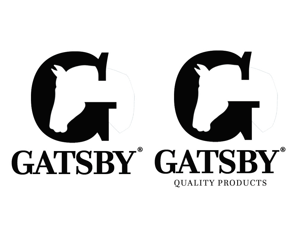
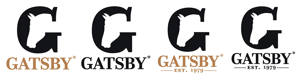
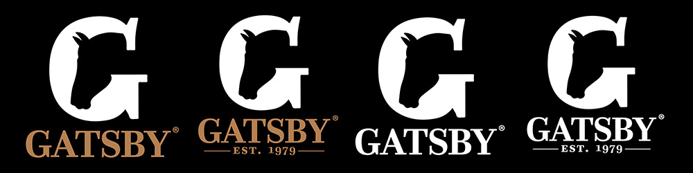
Once the design was chosen the logo went through another round of refining and brand colors were chosen. A brand identity guide was also created and is to be used as a rule book for anyone wanting to use our brand. Strict guidelines were set in place using the guide book so that the logo and elements stay consistent whenever it may be used.
Primary and Secondary Logos
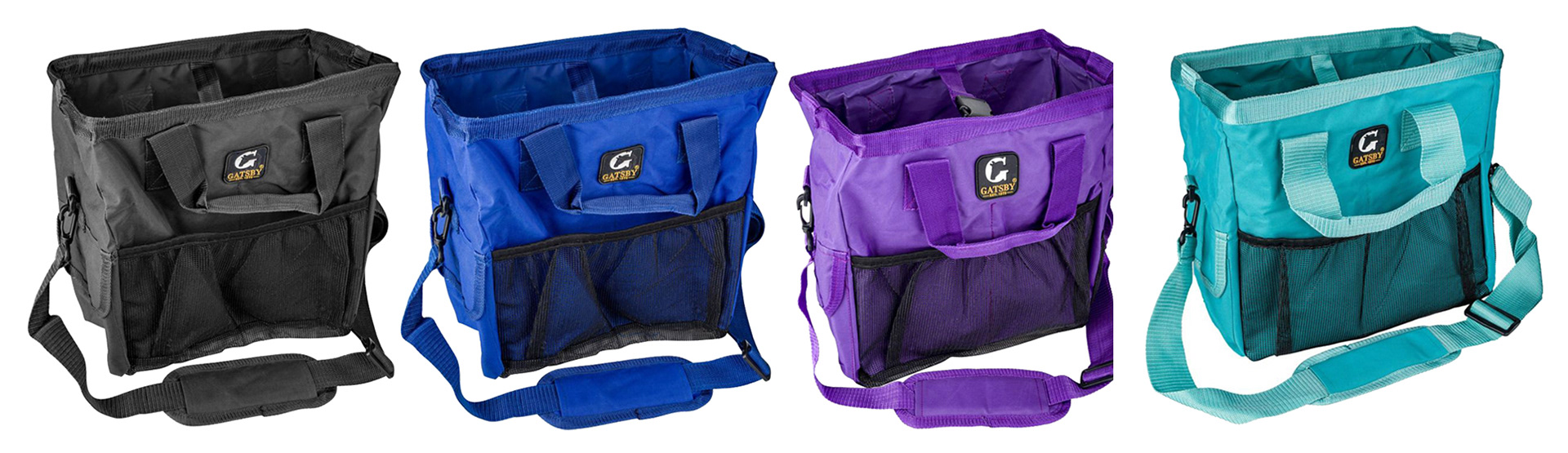
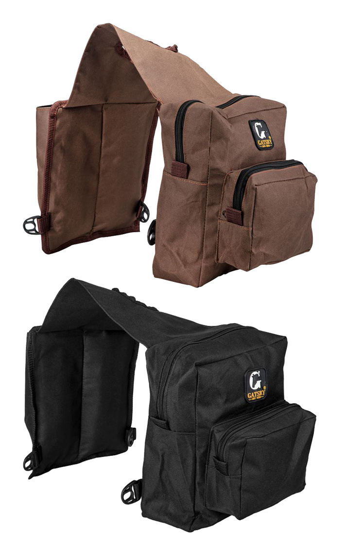
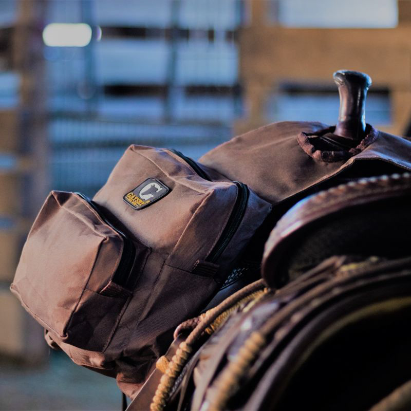
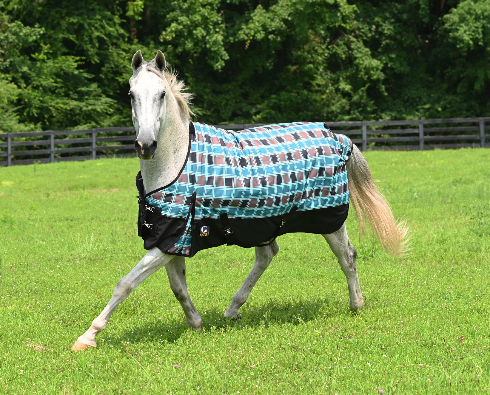
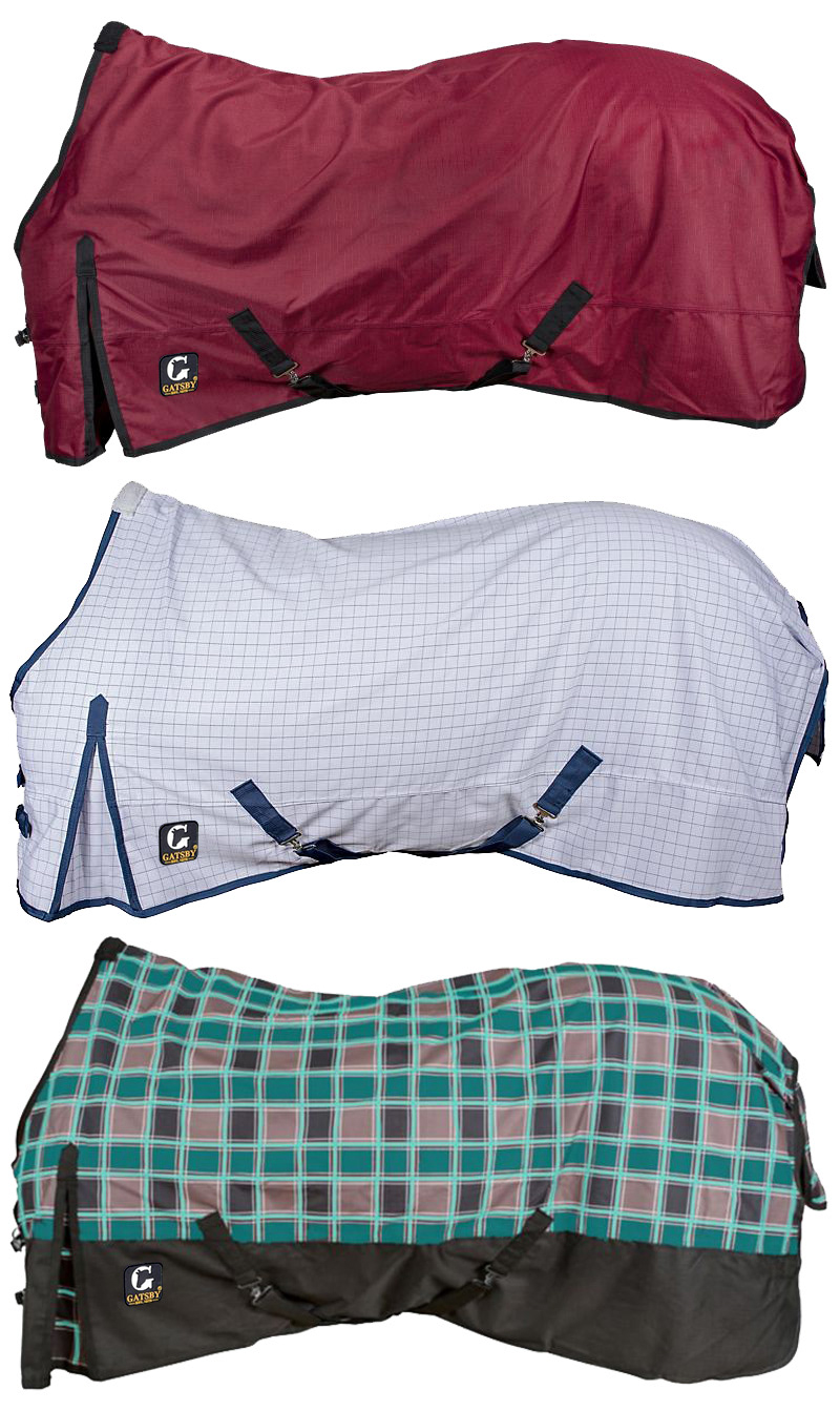
Apparel and Product Display
CONCLUSION
The thoughts on the direction for the brand were meant to be simplistic and were meant to translate well in any media. Gatsby® would be used across multiple media outlets including social, web and print. The success of a brand depends in many ways solely on visuals, however its marketing plan must be carried out successfully as well for the brand to take new life in an industry.
Programs and Tools Used